Motivation
This project began with a desire to apply some technical skills to the labor movement in the United States. I have been inspired by the many union wins in higher education, the union leadership reform movements in the Teamsters and the UAW, and the upcoming strike possibility at UPS with the Teamsters.
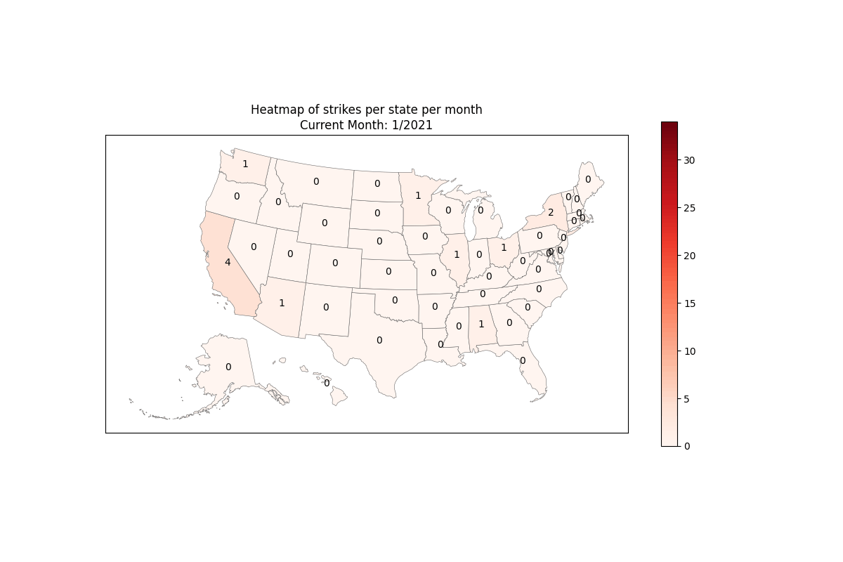
I had seen Cornell’s Labor Action Tracker (LAT) before, but I wanted to make something slightly different showing how many strikes are happening per state at a given time. This is somewhat captured in the LAT, but I believe the point of that project is to create a centralized database and show more specific information than what I was thinking of.
Labor Analysis
For this iteration of this project, I think more time is needed to draw any broader conclusions about the labor movement. One thing that is apparent is that California is regularly (69.8% of the time at time of writing) the state with the most strikes going on over the last few years.
Technical Details
I chose to use Python to gather the data from the LAT and to produce my final map. I had done some previous passion projects in Python webscraping, but I had never worked with mapping in this way. This was my introduction to shapefiles, and using them in conjungtion with other data to present information.
Getting the Data
The first problem was extracting the data from the LAT. I had hoped to just scrape using requests and use pandas to parse it, but unfortunately, since this tracker updates in real-time, it is a dynamically generated web page. I reached out to the creators to try and access the data in another form like a spreadsheet, but hearing nothing, I changed tactics. I used Selenium to get a copy of the web page including all of the labor data back to 2021 when the project started. The next problem was that the data needed significant cleaning. The version of the LAT that the end user looks great. Unfortunately, the structure of the data in HTML was quite difficult to parse programatically.
Mapping
I was new to using shapefiles, so this was a fun learning experience. I was unaware that the US Census Bureau creates standard shapefiles for the public to use. I hope to use make some political maps in the future using the congressional district maps they provide. I was struggling to get the map to display how I wanted, but then I came across the pygris project. According to the website, “the goal of the package is to make it simple to access US Census geographic data.” I was thankful for finding a package that helped automate some of the tedious mapping and sizing issues I had. I highly recommend it for those who are new to mapping in Python and need US maps.
Drawing the Maps
Unfortunately, I will probably be refactoring sometime soon. The first walkthrough I found on how to make choropleth maps suggested using matplotlib. I have recently discovered that plotly is probably the better choice for this, but alas, here we are.